DIYing your website is not for the faint of heart — it’s time-consuming, full of guesswork, and never seems to come out quite how you pictured it in your mind, but it’s yours. Still, with guesswork comes mistakes (because you don’t know what you don’t know), and with website mistakes comes a lack of conversions (and we all know where that leads).
That’s kind of where we’re starting today, though: covering what you don’t know so you avoid some of those mistakes and ultimately build a brand that’s more true to you.
Let’s talk about some of the most common website mistakes to avoid and why:
The Most Common Website Mistakes to Avoid (and What to Do Instead)
I see these daily (it’s one of the perks of being a Showit website designer), and they’re genuinely mistakes made because business owners — like you — are not made aware of the issue.
It’s also so easy to get lost in a sea of “well, everyone is doing it, so it must be right”, which isn’t always the case. You need to take this into your own hands so you’re not blindly following the crowd (you’re simply too unique to do so).
And, to be quite honest, I don’t love the word ‘mistake’ as it sounds so harsh, but it is the most accurate for today — so, here are the common website mistakes you should avoid when DIYing your website:
#1. Unreadable Fonts
I, too, am a fan of pretty scripts and thin, creative display fonts — but you have to use them in moderation. They’re hard to read and can create an awful user experience (aka how your website visitors ‘experience’, interact with, and view your website).
A good rule of thumb is if you have to ask yourself whether you’re overusing your script font, you probably are. Lucky for you, this is an easy fix! Simply reduce the use of your font.
If it’s a display font, I suggest heading back to where you purchased it to see if they offer a plain version (most do) for use in areas where readability is key.
#2. Not Enough Call to Actions
Your website should look stunning, breathtaking, spectacular, immaculate, Lady Gaga-level glamorous — that’s a given. But it should also be strategic and conversion-driven.
If done right, your site can absolutely be the main vehicle doing the heavy lifting for you in your business. But not having enough and not having the right call to action could be the missing piece between getting that “you’ve made a sale!” notification and crickets.
This is one of those changes you’ll want to make today (or tomorrow, but, ya know, sooner rather than later).
#3. No Whitespace
You have to give your content and copy room to breathe (and do their thing!) on your website. A lot of times people find design their site the exciting part, so they make sure every corner of it looks “designed” — aka putting everything waaaay too close together.
When you purchase a website template or hire a designer to work on your site, the white space, or distance between elements, is a key part of their process to make the user experience as amazing as possible. All the elements of your website should work together in harmony.
Unlike that empty drawer in your room, this spacing does NOT mean “let’s stuff it with everything I can possibly find”, m’kay?
#4. Inconsistent Imagery
We all have those Pinterest boards full of inspirational images that really don’t go together (seriously, we do: here’s mine). Still, it’s fine since we made this slightly embarrassing board (secret) a long time ago.
But your website? Not so secret. This is not the time to disregard your branding and choose whatever matches your mood that day.
In fact, consistency and cohesive looks are what can make or break your website. Time to buckle up and spring-clean those asset folders!
#5. Not Utilizing “Above the Fold”
The term means exactly that: above the fold of your website BEFORE the user scrolls down. This is your number one space to captivate your audience and let them know they’re in the right place.
To show you an example, Covent Garden, one of our Showit templates, has a key description of what the business does before a visitor even scrolls down the page:
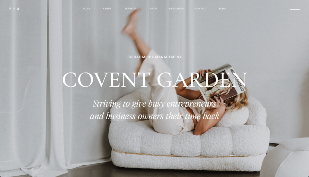
Ever visited a website where you just had no clue what they did or what you would gain from being there? It was most likely a lack of headings, imagery, and clear copy at the very top of the page, where first impressions are everything.
How to DIY Your Website Without the Guesswork
Are you making any of these mistakes on your website? You’re not alone, I promise. They’re common for a reason! But, next time you work on your website or add a page, make sure you:
- Don’t compromise on readability over pretty fonts
- Have enough call to actions and utilise them wisely
- Double-check your white space and distance between each element
- Are consistent in your imagery and stick to your brand guidelines
- Make it known to your audience what it is you do from the first glance
I hope you appreciate the quick checklist and have a clearer idea of what you need to avoid (and hopefully take out some of the guesswork).
I also want to remind you that you shouldn’t feel bad or guilty if you’re making mistakes on your website. You started your business because you love what you do, and unless you’re a web designer, designing your website probably is not your passion; it’s a necessity to build your brand.
Ready to make some digital magic and ditch the guesswork? Shop our bestselling Showit Website Templates to instantly elevate your brand (without all the overwhelm) — Click here to Explore the Shop.